Tables
Adobe RoboHelp comes with a number of pre-formatted tables that can be edited to suit your own requirements or you can create your own from scratch.
 Create a copy of the supplied table styles and edit the copy. Then if anything goes wrong, you can switch back to the original.
Creating a Table Using the Templates
In the screenshot below, a table has been added to a topic using the Insert Table icon in the standard toolbar. The breadcrumbs highlighted can be useful when editing.
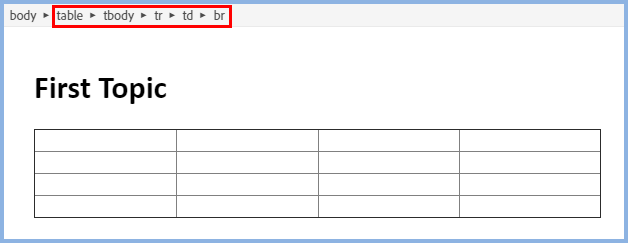
 When you insert a table, some inline styling is automatically applied to give the appearance shown above, rather than the default HTML table style shown on the left.
Before you apply a style from the templates, click the Clear Formatting icon highlighted below.
The table will change but when you apply a template or create your own style, it will not have any inline styling overriding your definitions.
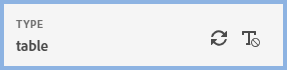
With the cursor in the table, the Properties panel will display an additional icon.
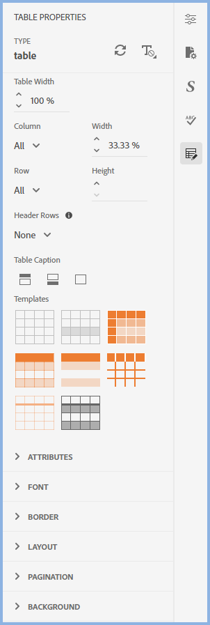
You can apply width and height settings to specific columns and rows or to all columns and rows.
The caption setting defines whether captions are required and, if so, whether they appear above or below the image. By default CSS3 centres the caption above or below the table. You can change it to left or right in the table properties.
There are also a number of templates that you can use as supplied or you can edit them to suit your own requirements as described in below.
Header Rows
With the table selected, the Header Row field shown in the above image allows you select the required number of rows to be defined as header rows.You can also right click and select rows in the context menu. The Convert To option will show various options depending on whether you have selected the first row, multiple rows or specific cells. You can also convert the table row/cells back to Body Rows.
In the PDF output table rows and cells will be repeated if the table breaks across pages.
Inserting and Deleting Rows and Columns
In the context menu, use the Insert and Delete options to add/delete single rows and columns where required.
If you select a number of rows/columns first, that number of rows/columns will be added or removed.
Column Width
There are four options in the context menu. The table and column widths can be set in various units of measurement but percentages work best.
Autofit to Contents - The width of the table and the columns will be adjusted to the best fit for their content.
Autofit to Window - The width of the table will be set to 100% to always fit the width of the window. The proportions of the columns will be maintained.
Fixed Width - Within the set width of the table, the column widths will be fixed to maintain their proportions. In a maximised window, the defined widths will be as set, in a minimised windows the table and columns will be sized to maintain the proportions.
Distribute Evenly - The width of the table will be whatever has been set and all columns will be the same width.
Creating Your Own Table Style
The easiest solution is to start with a supplied template and edit that.
If you will want to use the customised template again, create it in a Snippet. Add that Snippet to any topic and select the table breadcrumb, then right click and select Convert to Text.
If you want to start from scratch, this section describes how to do it.
In the screenshot below a table has been added to a topic using the Insert Table icon in the standard toolbar but the CSS used for the topic does not have a table defined.

Click the + icon to create a table style.
Select table as the tag and enter your name for the table class to be created, in this example it is blue_border.
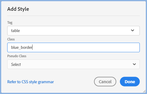
The default Properties will then be displayed for editing.
Defining the Table Style
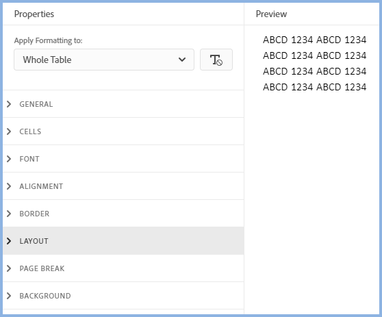
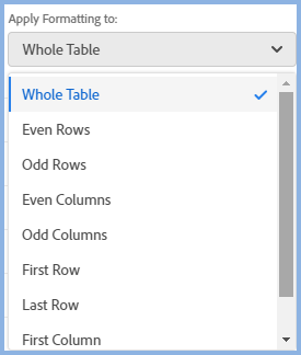
It is very important to note what has been selected in the Apply Formatting To dropdown and Whole Table is often misunderstood.
- Generally anything you set here with Whole Table selected will apply to all the cells in the table with the exception of the border. For borders Whole Table means the outer borders of the table, not the individual cells.
- If you change the dropdown to one of the other options shown, then the formatting will apply only to whatever you have selected.
You will need to experiment a little to get what you want but you will soon find it is simpler than it may appear.
Try setting up fonts and shading with Whole Table selected and then select any exceptions in the dropdown shown above.Maybe you want all cells to have one colour as the background but the First Row to have another colour. Set the first colour with Whole Table selected, then select First Row and select the second colour.
Defining the Borders
Easy when you know how!
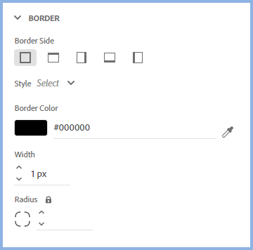
Let's say this table is to have a 1pt wide border around all cells and a 2pt border the same colour around the outer edges.
Set the border as below.
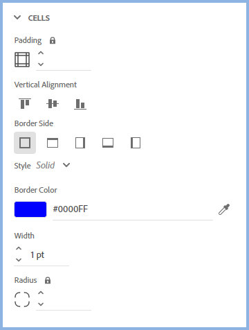
Then set the cells.
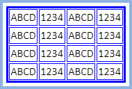
In Preview the table will look like this.
In the General settings for the table, set Border Collapse to Collapse.
Here's that table back in the topic.
Use the breadcrumbs above the topic to select the part of the table you want to edit.
Different Formatting in Columns, Rows or Cells
No matter how well you design your table in the editor, there will often be occasions when a particular column, row or cell need something different.
You can apply an overriding style by clicking the Styles icon and applying changes to individual cells either using inline styling or applying a style from your CSS.
Aligning the Table and Cell Content
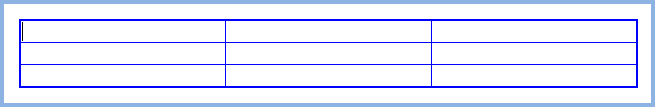
This table has been set to 75% width and the first row has been set to 150pt height.
| Some sample text. |
|
|
|
Table Position To position any table that is set to less than 100% width, click anywhere in the table and then click the Horizontal Alignment icon in Table Properties > Layout and set it to Left, Centre or Right alignment. To indent the table to a specific position, go to Table Properties > Layout and apply the required margin. |
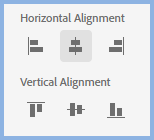
Text and Image Position In the two cells above, two settings have been configured to get the text centered horizontally and vertically.
To apply Horizontal alignment to click in the text and then go to Content Properties > Font > Text Alignment.
To apply Vertical alignment select a row/column/cell and then go to Content Properties > Font > Vertical Alignment. Select a row, column or multiple cells by dragging the mouse, select a single cell by right clicking selecting Select > Cell. You can also use the breadcrumbs. |
|
Updating the Style and Clear Formatting
If you make amendments to a table style while working in a topic, they will be applied inline. If you want to update the style to reflect those changes, click the Update Style icon on the left.
To remove all styling from the table, click the Clear Formatting icon on the right. This will remove all styling from the table you are working on but will not affect the style unless, of course, you then also click Update Style.
Tables with Rounded Corners
In the HTML5 and CSS3 world, tables with rounded corners and cell borders require complex coding. The rh_2022_1.css file in this project contains such a style.
When you apply the style to a table, it will initially show in the Editor with square corners. Select the table breadcrumb and go to Code View. There you will see table code written as below.
<table border="1" cellpadding="1" cellspacing="1" class="rounded-corners" style="border-collapse:collapse; width:100%">
Edit that to read
<table class="rounded-corners" style="width:100%">
Then the table will display correctly. Guidelines may still show in the corners in the editor but they will not be shown in Preview or the Output.
Donations
If you find the information and tutorials on my site save you time figuring it out for yourself and help improve what you produce, please consider making a small donation.