The Skin Editor
The skin editor now allows changes to all skins.
There is also a change in terminology.
- Previously, the design was referred to as the layout. There were also problems when the functionality needed to be changed that resulted in the loss of customisation.
- Now "layout" will refer to the structure and "skin" will refer to the appearance.
The changes mean the terminology for both outputs is now the same and Adobe can change the underpinning code of the layout without any loss of customisation.
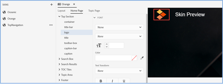
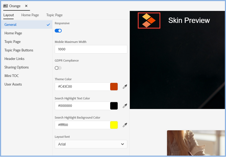
Click Output > Output Settings and then click Skins. When you select what you want to edit, a preview will display on the right along with the Skin Components you can customise. As you click each component, its properties will be displayed on the left of the preview for editing.
Because the Logo setting has focus, the preview on the right has a red square showing what will be affected by any changes made.
Duplicate Skins
You might want to make some changes to a skin either because corporate branding is about to change or you just feel that some tweaks are needed. You don't want to play with the current skin though until the new one is ready. Use the context menu to duplicate a skin or export one.
Editing Skins
The Skin Editor offers many more options to customise a skin than in Classic versions. This section is a guide to what the options are but does not describe each option in detail.
Skins with Home Pages
The home page shows icons to access the top level books in the table of contents.

All the books above are shown with the default images. You can change them in the skin editor. In the Layout Page tab go to TOC Tile Images to set your default images. If you set just two images, the images will be applied to every other book. If you set three or more, they will be applied in series.
In the skin editor you can set your image to cover the whole area and have the text sit on top of the image. In the skin editor Home Page tab, set the background opacity for tile-details-box to zero and the font color to whatever you require.
The font color for the number of articles is set in tile-topics-count. Note that the settings in the skin editor will apply to all the books.
Alternatively, you can manage the tiles from the Table of Contents. In the Layout tab > Home Page options select Manage Tiles from TOC and the tiles you define there will be used instead.
Using This Type of Skin Without the Home Page
This will open with the default topic displayed and work more like traditional help. Note though, no frames! It's all done with DIV tags. Each topic has a simple URL.
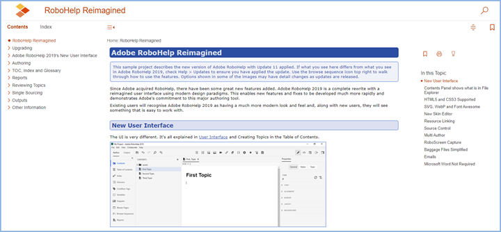
Home Page and Default Topic
This is simply the home page you see in the first image with your default topic below it. That can be configured in the skin editor.
Configuring the Skin
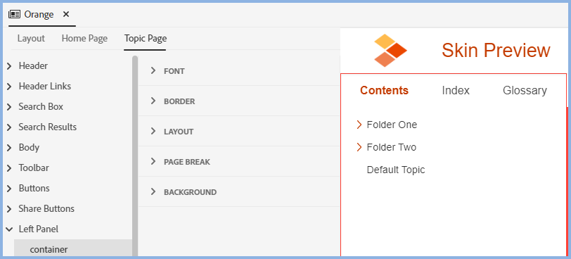
The options vary according to the skin selected. The screens below are for the frameless Orange skin but all skins broadly follow the same layout
The skin editor has many more options than ever before and you will likely find you can create whatever you want by digging into the editing tabs. As you drill down through the various options, the image will be highlighted to show the area you are working on.
The Preview
The skin editor shows a live skin.
Note that Container has been selected and Default Topic has no icon shown to the left of the text. It has not been clicked on so it is displaying as an unselected topic.
By clicking on Default Topic, the icon is then displayed as that has become the selected topic and displays with the icon for a selected topic.
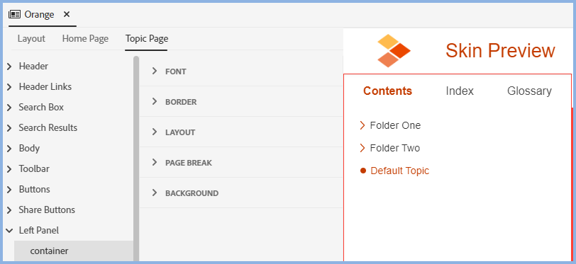
Similarly, click on other areas such as the search icon top right to see what a user would see if they click on that icon.
The Layout Tab
User Assets
In a preset you can select a script that is to run when the output is generated. In User Assets you need to select that script defined in the preset along with any assets it requires such as a CSS file.
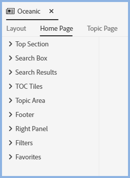
The Home Page Tab
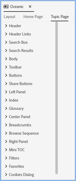
The Topic Page Tab
The Options
There are more options than ever before and it is beyond the scope of this sample project to cover them all.
Some Highlights
- All the text can be set to your preferred fonts, weights and colours.
- Colours and images can all be changed.
- The size of different areas can be set as required.
- Borders can be set to whatever width you want and have square or round corners.
- The skins have a Download PDF button. In the preset layout tab you can define the path enabling users to download a PDF of the help. If you don't want to use that option, delete the button from the skin.
- In Frameless outputs the header and footer can be made static. Layout > Topic Page > Static Header/Footer.
- The skin is created from the DIVs defined in the EJS and the supporting CSS files. Expert users can edit those as well but the skin editor should cover most requirements.
508 and WCAG Compliance
All frameless skins and the Azure Blue and Indigo HTML5 skins added to projects in this version are 508 and WCAG compliant as supplied.
 Customisation and Compliance
If you apply any customisation, then you must ensure that too is compliant. Your customisation could break compliance if, for example, you define colours that do not have the necessary contrast.
You must also ensure that your content is compliant.
 If your project has been upgraded from any earlier version, it is recommended that you add one of the above skins.
Donations
If you find the information and tutorials on my site save you time figuring it out for yourself and help improve what you produce, please consider making a small donation.