RoboHelp 11 - Responsive Layouts
Responsive HTML5 layouts are easier to work with than Multiscreen HTML5 as there is only "one" layout.
- With Multiscreen HTML5, you specify a different layout for each device. Some authors will prefer that approach as they can use very different layouts with different devices and have different content on each device.
- With Responsive HTML5, one layout is used on all devices. What happens here is that if the user is viewing on a desktop, they will see one arrangement of the components of the screen, if they are viewing on say an iPhone or Android phone, they will see the components resized and rearranged in a layout to better suit that device. Your Adobe RoboHelp output takes care of all that. Generate an output from one of the sample projects and view it on a desktop where you can resize the window to see it happening. Notice how the images get resized on the fly.
Setting Up
You can follow the steps below by opening either of the sample projects that ship with RoboHelp 11.
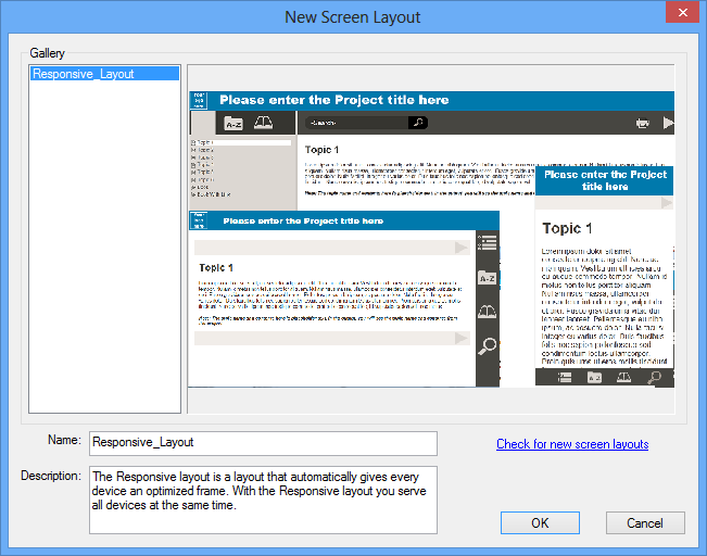
In Project Setup, you will see a Screen Layouts option. Right click that to open this dialog. Note the Check for new screen layouts link as more will be added in the released version of RoboHelp 11.
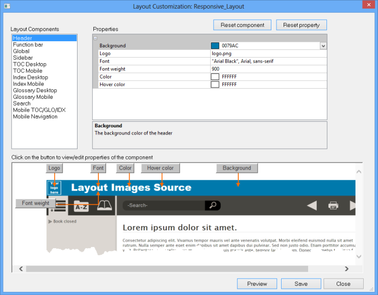
Having picked your preferred layout, expand it to see its parts. As with Multiscreen HTML5, you can right click any of the resources it uses but there is now a much easier way to edit selected items. Right click the layout name itself and click Edit to open the simplified layout editor. It provides the options that most authors will want.
That's it, your Responsive HTML5 layout is ready to be integrated into your project.
Generating the Output
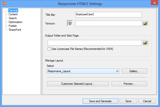
The General settings allow you to select the screen layout to be used in this Responsive Single Source Layout.
- If you change your mind about what you set up earlier, you can select a different one from the dropdown.
- You can add to the list by clicking Add from Gallery.
- You can make final edits by clicking customise.
- You can check the appearance by clicking Preview.
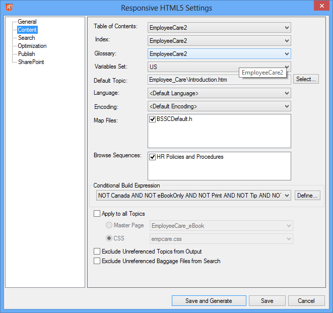
Content
The Content settings are the same as with WebHelp. With Responsive HTML5, the content will be the same on all devices. Use Multiscreen HTML5 if you need to have different content on different devices.
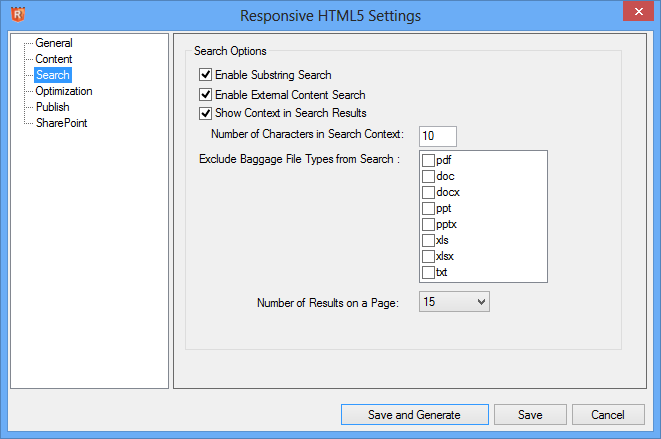
Search
The Search settings are also the same as with WebHelp.
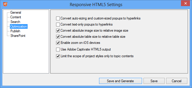
Optimization
The Optimization settings are the same as with Multiscreen HTML5 and need to be defined for the range of devices you will be supporting. For most authors, the settings will be as shown below.
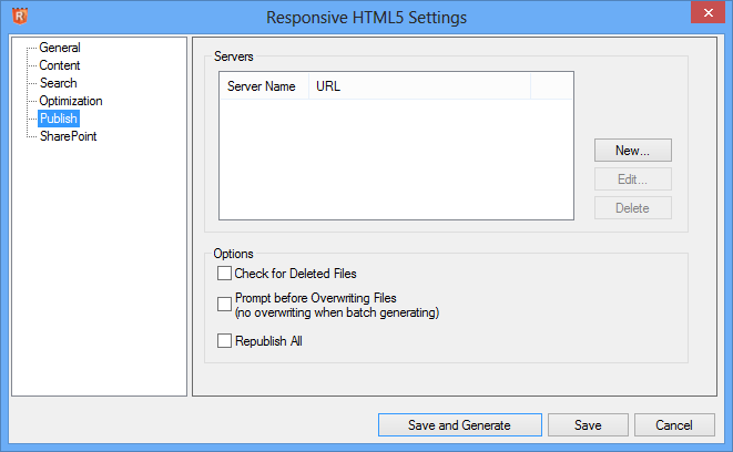
Publish
The Publish settings enable you to place your output directly onto a server. Use these or just give your developer everything that is in your Generate folder.
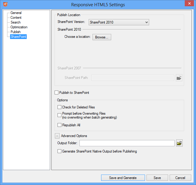
SharePoint
If you use SharePoint, the settings will need to be defined here.
Summary
This is a significant addition as it provides an HTML5 output without the complexity of Multiscreen HTML5. The latter will still be required by authors wanting different designs for different devices and perhaps different content. However, where those features are not required, responsive layouts provide an easier entree into the world of HTML5.
Expect to see additional responsive layout designs
Donations
If you find the information and tutorials on my site save you time figuring it out for yourself and help improve what you produce, please consider making a small donation.