RoboHelp 11 - User Interface
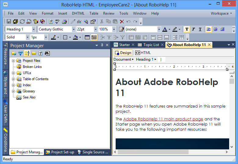
The colours of the user interface have been changed to provide greater contrast. This makes a huge difference when working on a project and during the beta testing I found it a pain when I had to revert to RoboHelp 10 for production work.
The toolbar icons remain unchanged and I have mixed thoughts about that. With ribbons the icons are much larger and can be made easier to identify and some say that is better. I do see their point but that also means that you can be flipping around different ribbons to perform a task. With all the icons always visible you don't have that problem. I see ribbons as a mixed blessing and I am happy that focus was given to improving the interface.
Donations
If you find the information and tutorials on my site save you time figuring it out for yourself and help improve what you produce, please consider making a small donation.