RoboHelp 10 - Multiscreen HTML5
Overview
In previous versions of RoboHelp you could generate WebHelp that could be viewed on a PC. It might also have been possible to view that on smartphones and tablets using the browser but that was not supported and might not work as expected.
Multiscreen brings the ability to generate different outputs specific to smartphones, tablets and PCs, with each output designed for their respective operating systems. This is done using the features provided by HTML5.
The basics are:
- Screen profiles are required to suit the device(s) your help will be viewed on. Default profiles are supplied that you can use as defined, you can edit those profiles or create new ones to suit your needs. These provide a mechanism by which the help can detect what screen it is to be displayed on and deliver the correct help for that screen and operating system.
- Accept the supplied layouts or edit them using the Screen Layout editor or create your own.
- In a Multiscreen SSL (single source layout) the profiles are mapped to the screen layouts and define the content for each profile. The default mappings can be changed to suit your needs.
Keypoints
- Because this layout does not use frames in the same way as WebHelp, you can generate a Desktop output that will work locally as well as from a server. Now your help can look the same whether it has been installed locally or is being delivered from a server. Effectively the Desktop output is WebHelp using HTML5.
- The term "multiscreen" is used rather than "devices" as a tablet might have the same size screen as a small laptop and authors may want to differentiate their outputs based purely on screen size, not whether it is tablet or laptop.
- Each screen profile you define can be based purely on size, by browser agent or a combination. That allows you to create a different screen profile based just on screen size or screen size and/or browser agent. Thus the profiles are not linked to a device type, hence Multiscreen being the term used.
- HTML5 is also part of the title of this new layout to reflect that the output is HTML 5 compliant.
- The workflow enables you to define as many screen profiles as you require.
- Importantly it also allows you to define as few as you require so if you only require WebHelp but you want to take advantage of HTML5 for your layout, this is the single source layout to use.
Scenario
To help explain Multiscreen, let's work with a specific scenario.
You have a program that allows users to enter absences, holiday requests, expense claims and suchlike via their desktop. The program uses WebHelp but now your developers are producing an app so that just allows expense claims to be submitted from an Android smartphone or an Android tablet.
Depending on whether your full program was installed locally with a server back end to collect the inputs or was a full web application, it is likely a CHM or WebHelp was produced. What your developers now need from you for the expense claim app is a very cut down version of the help just covering the basics of claiming expenses. You could apply conditional build tags to the existing content and that would give you the information you need but that's not enough, the appearance also needs to be difference on a smartphone. This topic will explain how you can produce all the required outputs from your RoboHelp project.
Screen Profiles
Multiscreen is about producing help for different devices from one single source layout so that both the content and appearance are different on each device.
To make this possible, the first thing that needs to be determined is some information about the devices. A list of all the smartphones, tablets, and PCs is clearly impractical. It would be unwieldy and as manufacturers release new devices, it would be out of date within hours of being produced. Instead the answer is to define a profile that says "If the screen is within these parameters and/or this browser agent is defined, then present a screen layout that has been linked to the screen profile". The screen layout is what determines the content and appearance and we will cover that later.
The screen profile is where you can set up the screen sizes you want to define and/or the browser agents that may be used. For this scenario:
- You need one profile for the full help that was previously produced using the WebHelp layout. This need not specify any screen size parameters or browser agents. In this scenario, you could continue to use the WebHelp layout but for the purposes of this exercise, we want to take advantage of the HTML 5 output for the core program.
- You need another profile for the Android smartphone because you want the layout and content to be different.
- You could have one profile for both Android the smartphone and the tablet by setting the parameters to something that would work for both. The content would be the same and the device would handle to sizing and in the real world that can be the most pragmatic solution. However, for the sake of this exercise, we will have a separate profile so that we can link it to a different screen layout.
Setting up the profiles
In a project created in RoboHelp 10, there will be some default profiles as shown below.
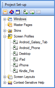
The screen profiles required in this example are:
- Desktop PC
- Android Phone
- Android Tablet
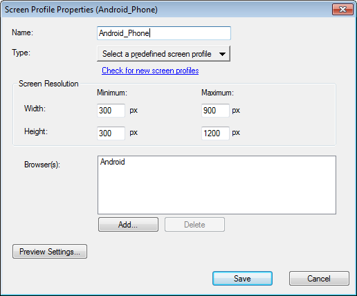
Predefined Screens are included with RoboHelp that cover our three requirements. Here's one of them
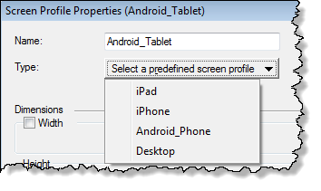
If a predefined screen was not available, it would be easy to create one. Just right click Screen Profiles in Project Set-up and select New Screen Profile.
A default name is provided but I suggest you change that to something meaningful.
You can select one of the existing Types to generate defaults into the other fields.
The table below describes the fields.
|
Name |
Whatever name you want to know this screen profile by. No spaces allowed |
|
Type |
You can optionally use this to populate the other fields with defaults. The "Check for latest information" link accesses the latest profiles on adobe.com |
|
Dimensions |
Set any minimum and maximum sizes you require. You should set a maximum height. A minimum should be specified where you have another screen profile for smaller screens. Widths are optional. |
|
Preview |
If you want the profile to be shown in RoboHelp's preview, tick this field. You can use a device image if required and you can define the position of the profile in the preview screen as well as the position of the content relative to the image. |
|
Output |
Specify the browser agent(s) You could have one profile for Android and iPad in which case you would list both Android and Safari as the browser agents If you want the content and/or appearance to be different on those devices, you would create two profiles each containing only one of the browser agents. |
Trying to define profiles based on screen resolution can be tricky with Android devices, especially if you are doing it for the first time. Some of the high-end Android smartphones have a higher screen resolution than many Android tablets. As a result the layout intended for the Android tablet will be seen on a high-end Android smartphone.
The easiest solution is to match profiles with layouts based solely on the browser. In other words one layout for desktop, one for Android devices, one for iPhone and one for iPad. The default profiles will define the browser agent, just increase the maximum width and height to 99,999 for all devices.
You may find you are quite happy with just two layouts, one for any smartphone or tablet (Android, iPhone or iPad) and another for desktop users. The phone layouts work equally well on tablets. For that scenario you would create a profile called say Devices that lists Android, iPhone and iPad as the browsers and another called say Desktop with no browser defined.
Screen Layouts
Multiscreen outputs are in HTML5 format and HTML5 does not support frames. Traditional help has used three frames, the toolbar frame, the navigation frame (the TOC, index and search) and the topic frame. Now the layout of the screen will be defined by using DIV (division) tags that create screen areas where you want them. That could be the traditional layout but you can reorganise those and you can have additional areas.
Screen Layouts are used to set up what goes where. They are not the same as skins where you define colours and suchlike. This is much more and covers the positioning of the elements of the screen and what elements are available. The skin is just a part of what the layout defines.
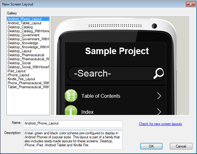
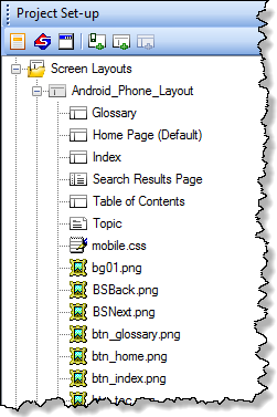
You can create your own layouts using the Screen Layout Editor or you can use one of the supplied layouts, as supplied or edited. For the purpose of this exercise we will use the supplied layouts and use the iPad layout for Android tablets. Editing and creating screen layouts is covered in RH10 Screen Layout Editor.
Screen Layouts in Project Manager
In Project Manager you set up the screen layouts (stored in .SLZ files) that you will want to use for any multiscreen single source layout that you have in the project. Your project may have many multiscreen layouts in the same way as it can have many webhelp single source layouts.
For our requirements the default layouts in Project Manager can be used. There are more in the Gallery, simply right click Screen Layouts in Project Set-up and select New Screen Layout where you will find the supplied layouts under Gallery. The Check for New Screen Layouts link enables you to check with adobe.com for revised and new templates.
You can create your own layouts but be aware that that requires extensive CSS knowledge. It may be a job for your web designer.
Layout Details
Within each layout you will see the default pages and images used. Editing the layouts is outside the scope of this page. See RH10 Screen Layout Editor
Generating the Multiscreen Layout
Now we have the required screen profiles and screen layouts and can proceed to generating our output.
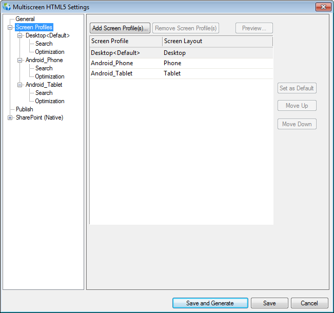
In a new project there will be a Multiscreen single source layout, double click that to display the configuration dialog. In upgraded projects you will need to right click the Single Source Layout pod and create the layout.
What you will see under Screen Profiles on the left is all the profiles in the project but you don't have to use them all in each layout, that is something you will determine by using Add Screen Profile(s) and Remove Screen Profile(s) on the right.
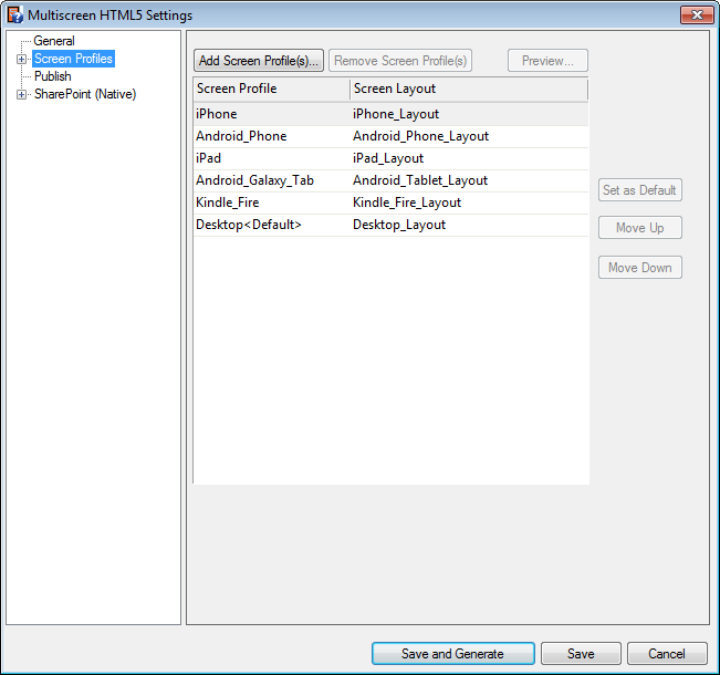
We do not want iPhone and iPad in this example so we will delete those by highlighting them and clicking the Remove Screen Profile(s) button. That only removes the profile from the layout, not the project. We can then set a default and the order in which the profiles appear. We also need to map the profiles to the screen layouts so that we end up with the required profiles mapped to their screen layouts.
Setting up the output for each profile
Let's look through one of the profiles to see our options.
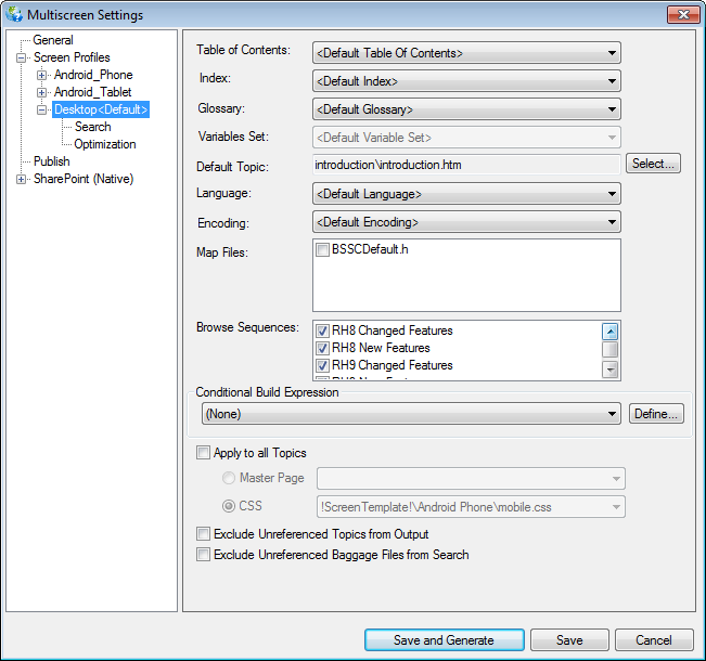
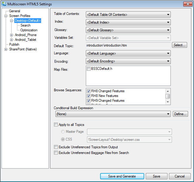
General Settings
When you click on any one of them, you will see this familiar page. By creating a Conditional Build Expression and selecting the other options, you define what will appear in the output for this particular profile.
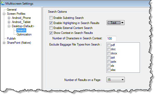
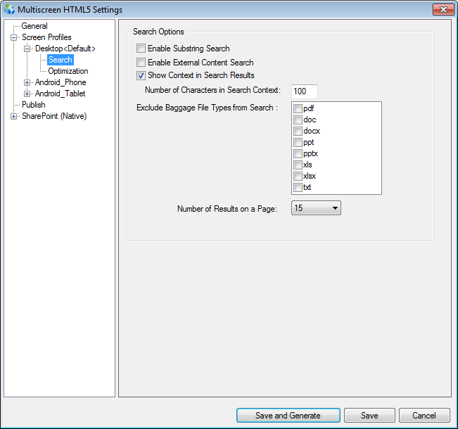
Search Settings
These are also familiar except for the new ability to Exclude Baggage File Types from Search. Just tick any file types you do not want searched. These are the only file types that RoboHelp searches.
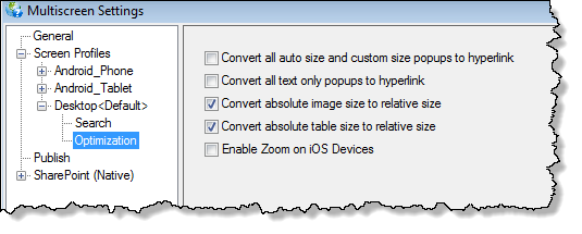
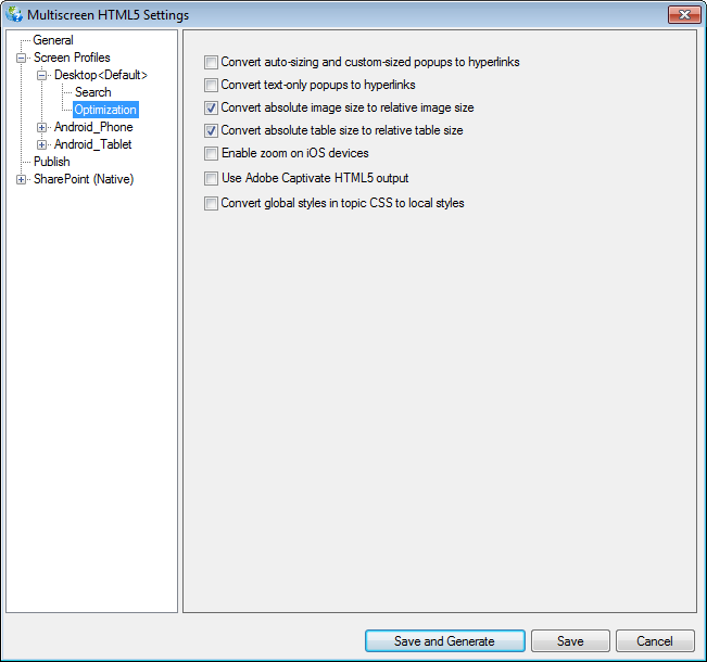
Optimization Settings
These are new and enable you to apply settings specific to the profile. For example, you cannot have popups on an Android device so the first setting allows you to retain them for the Desktop profile but select the option in the Android profiles.
Preview
With those settings applied for each profile, you can Preview topics in a new way that let's you compare them.
I will update this page with more information about that later.
Generating the Outputs
In new projects created in RoboHelp 10 there will be a new layout - Multiscreen HTML 5.
In upgraded projects, right click in the Single Source Layout pod and select Create New and select Multiscreen HTML5. You can then map the Screen Profiles to the Screen Layouts, as I have done in the screenshot below.
The General, Publish and Sharepoint settings are outside the scope of this topic so here we will focus on just the settings for Screen Profiles.
Screen Profiles
Under Screen Profiles you will see all the profiles in the project and when you first access the layout, they will all be listed on the right.
-
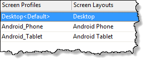
In this example we want all the layouts so our next step is to set which layout is to be used for each profile.
-
If we did not want to generate an Android phone output, we would simply highlight that on the right and then click Remove Screen Profile(s).
-
Each time you access the layout, the list on the right will show all the profiles in the project so if you have added some new ones, or want to add Android phone back in, you can do so with the Add Screen Profile(s) button.
Desktop / Android Phone / Android Tablet
For each profile, you need to define the content that will be presented when that profile is used. You may want to exclude some content when users are viewing using a smartphone, for example. The options on this page are familiar and are set for each profile.
Search
Similarly, you can define different search options for each profile. Note the new option to exclude specific baggage file types from the search.
You may want to specify a different number of search results for smartphones and desktops. Also you may want to exclude certain baggage file types from smartphone / tablet search results.
Optimization
Finally, you can optimise the output for each profile. For now I must refer you to the online help for each item.
Save and Generate
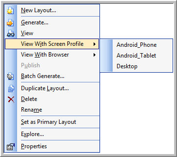
When you generate you will see the usual View Result button and that will open the help using the default profile.
You can also right click in the Single Source Layout pod and select a profile there.
Handing over to the developer
This is what you will find wherever you have generated the help. A few files plus a folder for each profile you generated.
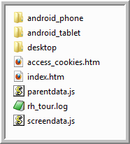
The index.htm is not the starter page you are familiar with in webhelp that launches the tripane window. It is a sniffer. The idea is that if the help is accessed from a server, then it will check the device that is being used and present the help that matches the profile. So if the help is accessed from an Android phone whose dimensions are within the criteria set for the phone, then the content and layout for that profile will be used. If the help is going to be delivered from a server, it is important that all the outputs in the single source layout are uploaded, not just some. If at some point it is decided that say the Android tablet output is no longer required, the single source layout must be regenerated without it, you cannot just delete that output from the server.
If your developer intends to put the help onto a device along with an application, then they would install just what is in the appropriate folder. That has its own index.htm file that will launch the help.
Miscellaneous Notes
- To meet a requirement such as if you want Desktop help to be in Black and White with no background shading when printed, you need to apply some media rules. See RH10 Style Editor
- Multiscreen does not support Dynamic User-Centric Content (DUCC).
- Multiscreen does not support Merged Help.
Demo and Download
You can view how it works on my site. This link will take you to the sniffer page referred to above. What you will see will vary according to whether you are using a desktop, an Android device, an iPhone or an iPad.
You can download the project that was used to create that. Click here.
Donations
If you find the information and tutorials on my site save you time figuring it out for yourself and help improve what you produce, please consider making a small donation.