RoboHelp 10 - Media Queries
Media queries allow you to define each style in a different way according to whether the output is
- iPad
- iPhone
- Android Phone
- Android Tablet
- Desktop
- Any profile you create.
Media queries are not exclusive to Multiscreen and can be used to set up your CSS so that, for example, WebHelp has one set of styles when viewed on screen but when the user prints the topic from the browser, the styles can be different. Previously that required two style sheets to be defined in a topic and RoboHelp did not always play nicely with that setup.
What are Media Queries?
When I first started looking at this I kept coming across references to Media Queries and Media Rules. Everywhere I looked the terms seemed to be used interchangeably and with no clear indication as to the difference. Eventually I found a clear explanation.
They are effectively two parts of a mechanism that enables you to query what media is in use, such as an Android Tablet or a Desktop PC, and when that query is matched, what rule is to be applied, such as the font to be used for body text. So the query might determine that the output is being viewed on an Android Tablet and show the text in blue or it might determine the output is being viewed on a Desktop PC where it is to be viewed in black.
How is this done?
The query part comes for the definition of the screen profiles you have created.

When you double click a CSS file in Project Manager, the CSS editor is opened and you can define the basic styles you require.
The Media dropdown allows you to specify that a variation of the style is to apply for specific media. The options shown there are the Screen Profiles that you have created plus one other, Print.
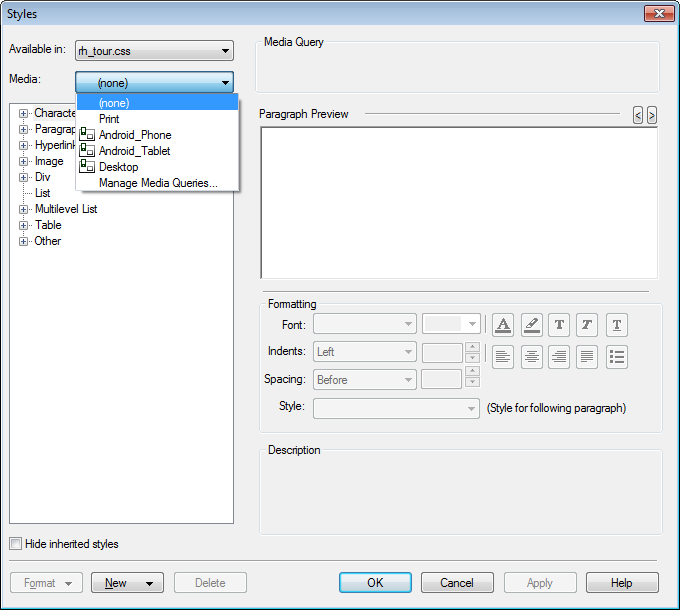
So using the example above we want blue text for all outputs except the Android Tablet and Print.
The <p> tag will be set to blue in the CSS as that is our chosen default colour. We need now to query when the output is to be something else and then apply the required rule. So we will select Android Tablet in the Media dropdown and then set Normal to say Red. After that we would select Print in the Media dropdown and then set Normal to say Black.
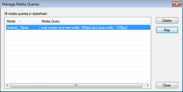
At its simplest, that is how you define different rules for each media. But what if you want to then apply the same rule to a number of other media? To save you then having to repeat the changes for each media, there is a Manage Media Queries option. So to set the same rule for say Android Phone, you would not duplicate the changes, instead you would next select the Manage Media Queries option. That shows the queries you have created for the Android Tablet and you simply click Map to apply the same rule to another media. A dropdown list will be displayed showing each screen profile you have created in the project and you would simply select Android Phone.
Note
Media queries are quite independent of Screen Profiles. Let's say for some reason you have two Desktop Screen Layouts, one for screens up to say 1024 by 760 and one for screens above that size and a media rule intended to make Heading 1 a different colour in the 1024 by 760 layout, if the user of a higher resolution screen reduces the window size to within 1024 by 760, they will see the colour defined by the media rule. It is the size of the window that applies, not the size of the screen.
Donations
If you find the information and tutorials on my site save you time figuring it out for yourself and help improve what you produce, please consider making a small donation.